

I Feel Prada in This Dentist's Office
Or maybe the anesthetics got to me more than I thought
No one understands chartreuse like Miuccia Prada. In a close second, though, is my dentist.
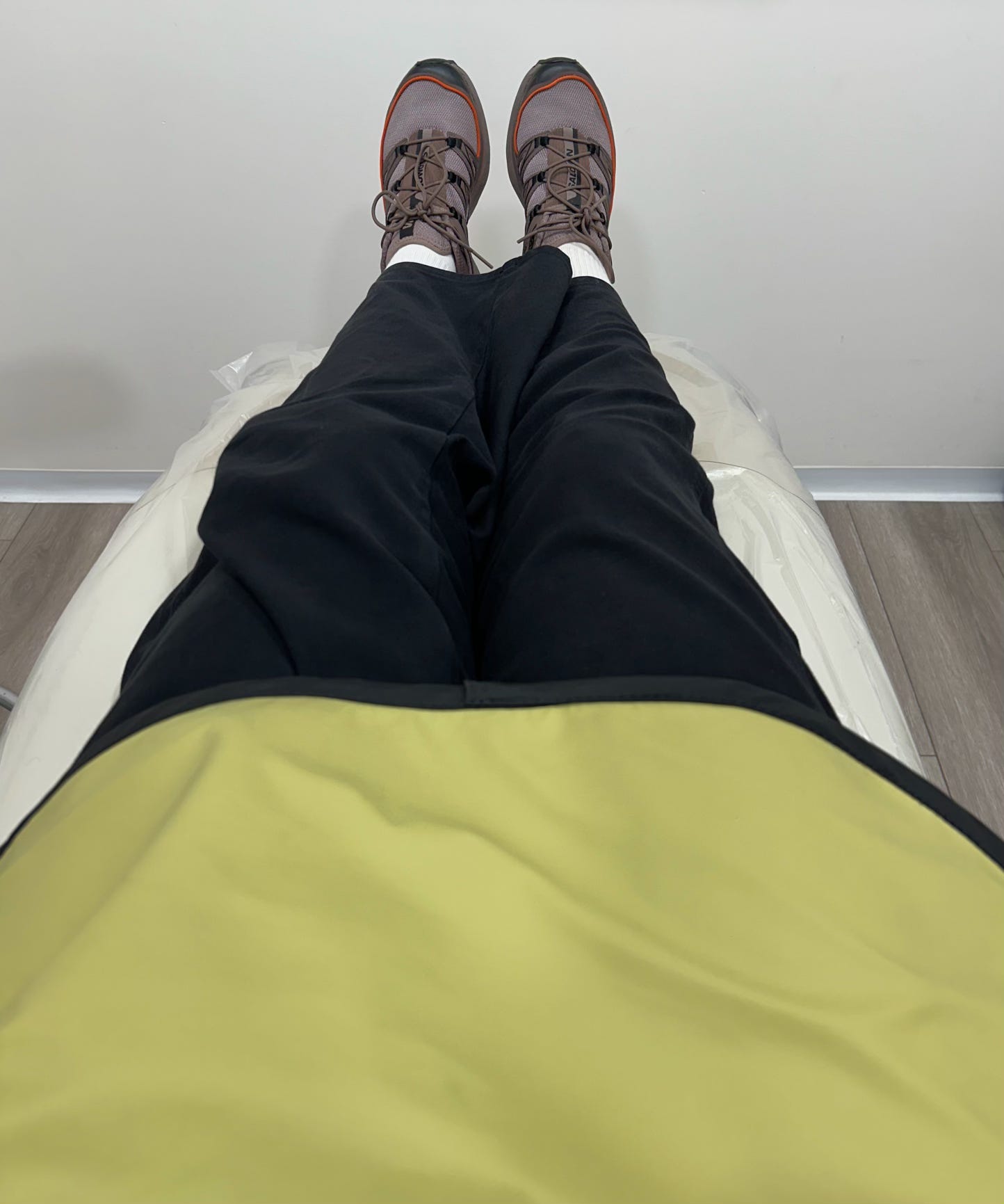
I spent five hours this week having my mouth drilled and glued and suctioned. My day was only redeemed by a chic radiation apron — it was a Prada-esque chartreuse, sleeveless, and had a mock neck collar (for that sexy touch of intrigue we’re all seeking in the dentist’s chair).
The first 20 minutes of my dental adventure were torture. The TV on the ceiling played a documentary about climate change flashing silent clips of chicks vomiting trash, carcasses wound in plastic, and a lone seal mum and pup searching for icy respite in a warm melted sea. Dr. Kim injected my gums as a polar bear leapt for the pup.
“Sorry, can you change the channel? I might start crying,” I mumbled with a mouthful of cotton. Dr. Kim, horrified to hear what I’d been subjected to, let me flick to The Great British Bake Off. Relief!
Then she brought in a beautiful radiation apron (an adjective no one has ever before used to describe a radiation apron), and as the anesthetics in my jaw spread a numbness through my face, this color story made me feel something.

Rust and chartreuse is a favorite color combo of mine. It seems my dentist had been perusing my Pinterest boards. Or maybe she’s just a Prada-head like the rest of us?


Miuccia has been drawn to nauseating shades of green since the ‘90s — the S/S 1996 Prada collection is marked as a pivotal moment in the Ugly Chic revolution, with swampy green at the helm leading the troops onto the Pantone battlefield.
Robin D. Givhan wrote for The Washington Post in ‘96 that Miuccia’s chosen green “hovered somewhere between shades of slime and mold.”
In a 2023 Prada-focused episode of COVERED, a podcast by Natalie Brennan and Ruby Redstone, Redstone shared a piece of wisdom a mentor once gave her: “If you want to get the magic effect of Prada in a collection, you just have to choose three good colors and one ugly one.” Both hosts go on to name which of the main colors in the F/W 1999 collection was the “bad” one: green.
And just earlier this year, Viv Chen of The Molehill described Prada green as “sickly” in a piece discussing its relation to 2024’s hottest shade, brat green. “These are sickly colors, visual symptoms of biological malady — jaundice, gangrene, etc.”


Under those fluorescent lights, swaddled in medical-grade Prada, sickly green was my antidote to illness. This shade — even lead-filled and plasticky to the touch in its dental iteration — felt like a safety blanket, keeping me both en vogue and shielded from radiation.
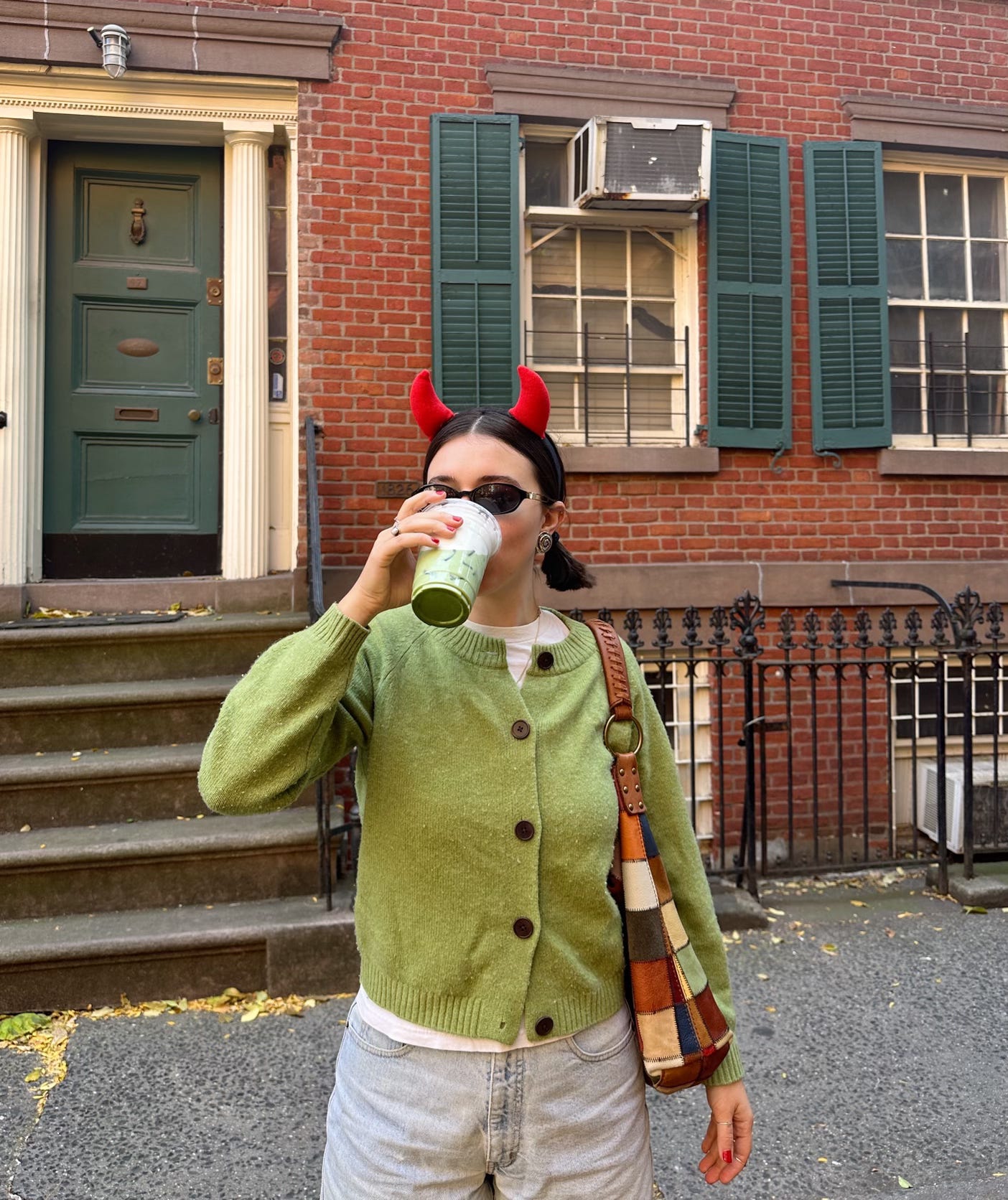
Chartreuse has long been a comfort color for me. In the cooler months, I practically live in this TOAST raglan cardigan. It’s an investment piece for sure, but trying to find a cardigan with the perfect fit, length, and feel is like digging for a sewing needle in a cashmere haystack. This luxurious 70% wool and 30% cashmere blend makes it a three-season sweater for me.

I kind of regret not wearing the sweater to the dentist that day. I wore an old sweatshirt instead, thinking I might get spittle on it or something, and I didn’t want to drool on my favorite sweater. In hindsight, I can see there’s actually no better place to wear your favorite sweater than to a medical procedure. Or maybe that’s the anesthetics talking.
So what was I doing finding God Prada in my dentist’s office? Surviving, I suppose. What else is there to do as you lie in a plastic chair without feeling in the right side of your face than to find Prada in the room?
Would love for my aura to be described as hovering between shades of slime and mold
Enjoyed this, Mac!
I’ve always associated bright green with radioactivity (Martian-like power plant workers glowing green after a days work).. so it’s funny (interesting) to see an apron designed to protect you from the radio waves in the color you might be glowing if it wasn’t there to protect you 🧪☢️😵💫